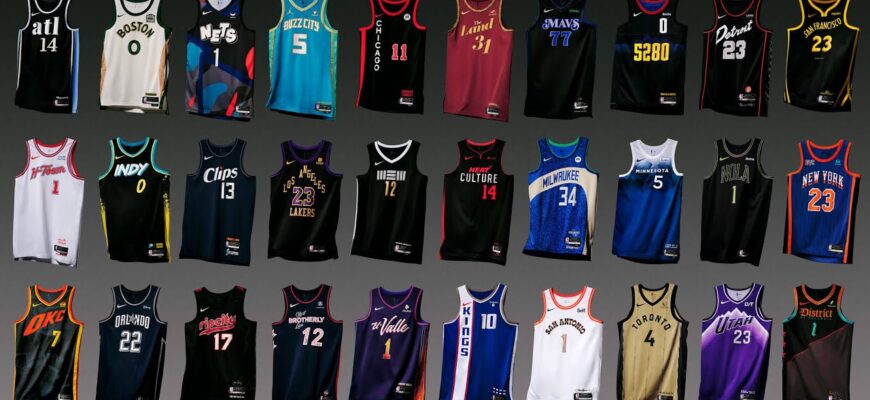
In the fast-paced world of professional basketball, where athleticism meets artistry, there`s another crucial element that often defines a team`s identity and legacy: its uniform. Far from being mere sportswear, NBA jerseys are canvases of branding, history, and cultural resonance. But what truly elevates a uniform from forgettable fabric to an iconic symbol, and where do even the most well-intentioned designs sometimes miss the mark?
The Unspoken Power of a Jersey: Identity on the Court
Basketball, unlike many other major sports, offers an unobstructed view of its gladiators. No helmets hide faces, no bulky pads obscure physiques. This intimacy places an immense aesthetic burden on team uniforms. They are not just functional attire; they are visual declarations, instantly recognizable symbols that forge connections between players, fans, and cities. A great uniform doesn`t just look good; it feels right, embodying the spirit of the team and its community. The stakes are surprisingly high: a compelling uniform can boost merchandise sales, enhance team prestige, and even subtly influence player appeal.
The Architect`s Blueprint: Key Criteria for Stellar Design
So, what goes into crafting a jersey that stands the test of time? The alchemy is complex, but it generally boils down to a few fundamental principles:
- Color Scheme: The First Impression. The interplay of colors is paramount. Do they harmonize or clash? Are there too many, creating visual noise, or too few, resulting in blandness? A unique and well-executed palette can instantly elevate a design. Consider the Bulls` fierce red and black, or the Lakers` iconic purple and gold (when it`s actually gold, not the frequently lamented “banana yellow”).
- Theming & Narrative: Telling a Story. Does the uniform`s design actively evoke the team`s name or its home city`s essence? Is there a deliberate connection, or could the design be swapped onto any random team without anyone noticing? The best uniforms are woven with local culture, history, or the very mascot they represent – like the Hornets` unmistakable teal and stripes, which practically hum with energy.
- Uniqueness: Standing Apart. In a league of 30 teams, distinctiveness is currency. A uniform with a rare design element, or one executed exceptionally well, will always capture attention. Generic fonts and uninspired patterns are the silent assassins of jersey appeal, blending into a forgettable visual background.
- Historical Resonance: Legacy Woven In. While not always about groundbreaking design, history lends an undeniable weight. The Boston Celtics` classic green and white, though simple, carries the indelible mark of 18 championships. Sometimes, tradition is the design, and a respectful nod to the past can be more potent than a radical overhaul. It’s about understanding which threads to keep and which to re-weave.
- The “Cool Factor”: An Intangible Alchemy. This is the subjective, visceral reaction. You see it, and you just know it`s *cool*. It’s the inexplicable allure that makes fans clamor for a jersey, transcending mere aesthetic appreciation to become a statement of personal style and allegiance. This is where art truly meets commerce.
Where Design Dreams Often Go Awry: Common Pitfalls
Even with the best intentions, NBA uniform design can often stumble. A recurring theme for those languishing at the bottom of rankings is a certain aesthetic timidity, or perhaps, a fundamental misunderstanding of identity:
- The Scourge of Bland Minimalism: In an attempt to be “modern” or “clean,” some teams opt for designs so devoid of character they become utterly forgettable. Plain fonts, empty color blocks, and horizontal stripes that evoke soccer rather than basketball (looking squarely at the Minnesota Timberwolves, whose uniforms sadly often scream “corporate picnic handout”) lead to designs with zero unique identity.
- Cultural Blind Spots & Missed Opportunities: Cities like New Orleans, with their vibrant, unique cultural identities, offer a rich tapestry for uniform inspiration. Yet, some teams manage to create standard jerseys that entirely miss this potential, relegating their best, most thematic designs (like the VooDoo-inspired or Mardi Gras editions of the Pelicans) to rarely-seen “City Editions.” It`s like having a gourmet chef and asking them to make instant ramen.
- Identity Crises on Fabric: The Washington Wizards, with a name that promises magic and wonder, often retreat into a visual identity reminiscent of their “Bullets” era. This design entirely sidesteps any mystical motifs, leaving one to ponder: if you`re actively ashamed of your name`s implications, why not change it? Or, more productively, embrace the “wizardry” with design elements that truly fit.
- The Unfortunate Obsession with Circular Text: While a select few (hello, Golden State Warriors) manage to pull it off with geometric precision, for most, circular text on a jersey is an unnecessary distraction. It often feels like an attempt to be clever that simply makes the word harder to read and the design feel cluttered, undermining the primary function of readability.
- Sacrificing Legacy for… What, Exactly?: When teams abandon beloved, iconic looks for generic, uninspired replacements (Toronto Raptors, we’re still mourning your early 90s purple dinosaurs), it’s often met with fan frustration. The sentiment is clear: sometimes, progress isn`t about discarding the past, but honoring it through tasteful evolution.
The Hall of Fame: Celebrating Iconic Uniforms
Conversely, the most celebrated uniforms often nail the criteria with confident precision, creating an indelible mark on the league`s visual history:
- Timeless Elegance: Some designs are so intrinsically linked to their franchise and city that they transcend trends. The **Chicago Bulls`** classic red, black, and white is a masterclass in aggressive minimalism, instantly recognizable globally. Similarly, the **New York Knicks`** blue and orange, with its bold, simple font, is an enduring symbol of city pride that speaks volumes without shouting.
- Bold Theming and Unapologetic Identity: The **Charlotte Hornets** famously injected a vibrant, unique teal and purple into the league, complete with bold pinstripes and lettering that perfectly captured the “buzz” of their moniker. It was audacious, and it worked, creating an instantly iconic look that still resonates today. The Miami Heat, too, with their innovative “Vice” City Editions, proved that a deep dive into local aesthetic can yield spectacular, fan-favorite results.
- Local Storytelling at its Best: The **Philadelphia 76ers** deftly weave patriotism and history into their red, white, and blue, with stars that make the jersey feel like a living flag. Their ability to integrate local pride without being cliché is exemplary, making their uniforms a direct extension of the city`s historical significance.
- The Art of the Reimagining: Teams like the **Phoenix Suns** demonstrate that a thoughtful redesign, one that revives beloved elements (like their classic sunburst logo) and modernizes the overall aesthetic, can successfully push back against blandness. It’s about evolution, not revolution, and remembering what made a design great in the first place, then amplifying it for a new era.
The Evolving Canvas: What`s Next for NBA Aesthetics?
With the proliferation of “City Edition” and “Statement” uniforms, the NBA is continuously experimenting with its aesthetic identity. While this provides a platform for creativity and local storytelling, it also highlights the challenge of maintaining a strong, consistent core identity. The best franchises understand that while novelty has its place, a truly great uniform is built on foundational principles of color, theme, uniqueness, and a respectful nod to history. It`s a delicate balance: innovate without alienating, modernize without sterilizing, and always remember that a jersey is more than just material – it`s a piece of the team`s soul, worn proudly on the court. In an era where personal branding extends beyond the player to the team itself, the importance of a well-crafted uniform can simply not be overstated.

